
Designer’s Note:
January of 2025
This project was my first step into the world of UX, and the UI design reflects my early skill level. However, the extensive research conducted, the use of the Goal-Directed Design process, and the solving of a complex challenge makes this project a valuable asset to my portfolio.

Otzi
a comprehensive social hub for tattoo clients and artists alike, simplifying the booking process for all


ROLE
📲 Lead UX Designer
TOOLS
💻 Figma & Figjam
SKILLS
📄 User Research, Prototyping, UI Design, Goal-Directed Design
DURATION
🗓 8 weeks (2023)
HERE’S THE DEAL
OVERVIEW
In the Spring semester of 2023, I was enrolled in Interaction Design I, a course at Kennesaw State University. In this class, we were tasked with utilizing Alan Cooper's Goal-Directed Design (GDD) process to simulate a realistic UX design scenario. Each student came up with an idea for a mobile app and pitched it to the class with a visual presentation. After the class voted on those ideas, we split up and 7 students, including myself, were made team leaders.
With my background in tattooing, I knew all about the frustrations of the booking process, and noticed that other artists and clients complained of similar difficulties, so I pitched my idea of a tattoo booking app to the class. After the votes were taken, 7 students, including myself, were made team leaders.
THE PROBLEM:

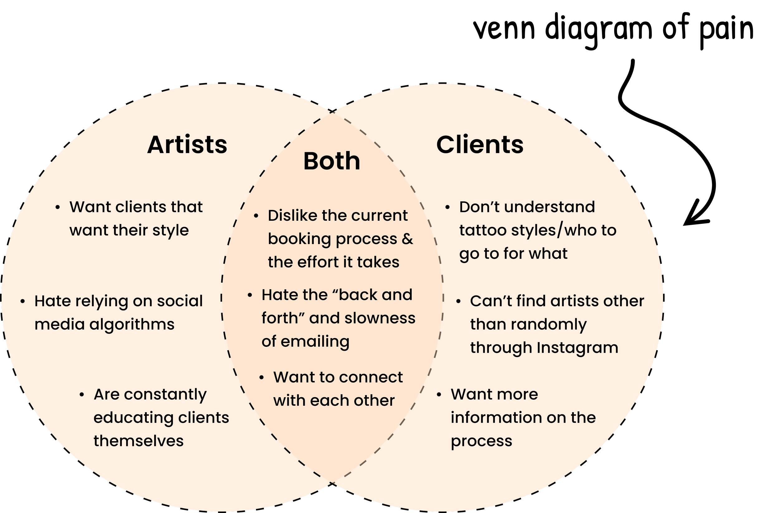
To be more specific, as someone who has been both a tattoo artist and client, here were some of the issues I noticed:
Where do we begin to solve any of these problems?
As team leader, I was in charge of organizing how we were going to approach the project, assigning tasks to my team, and scheduling group work sessions, as well as user research and UI design alongside my team. We communicated via Discord (both messaging and AV channels) and collaborated on a digital whiteboard via FigJam. Ultimately, the prototype was created using Figma.
WHAT’S THE BIG IDEA?
THE PITCH
THE APPROACH
A BRIEF OUTLINE
GOAL-DIRECTED DESIGN
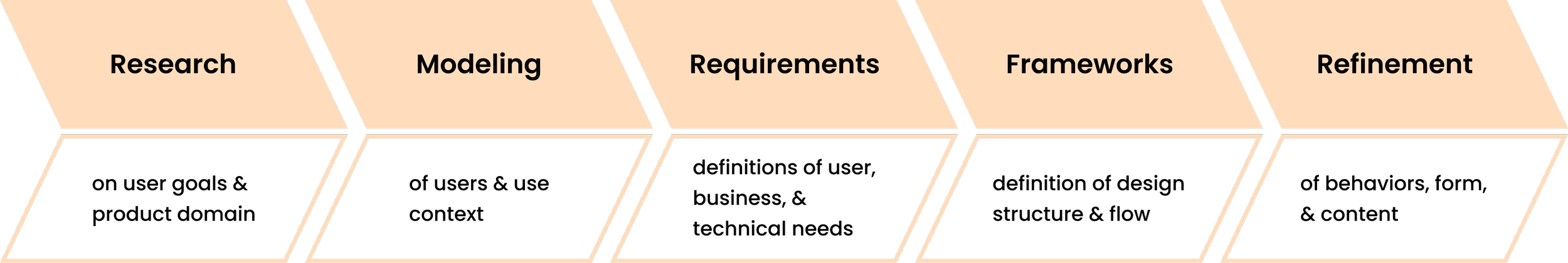
Before my team set out on our design journey, we collectively read About Face: The Essentials of Interaction Design by Alan Cooper. This book gave a detailed overview of the process of Goal-Directed Design (or GDD) and its five phases. GDD focuses on studying and understanding user needs and behaviors to eventually create a digital experience that satisfies those requirements.
RESEARCH
GETTING STARTED
In this phase of GDD, we needed to get an idea of the project constraints by gaining a better understanding of the app's users as well as business and market contexts. In this way, we are not merely designing for ourselves, but intentionally for users and stakeholders to meet the discovered goals.
My team simulated a Kickoff Meeting, collected information to created a Literature Review and a Competition Audit, simulated Stakeholder Interviews, observed and interviewed both tattoo artists and clients, and utilized Affinity Mapping to organize the data received from those User Interviews.
The current state of the tattoo booking services has focused primarily on financial gain from booking transactions.
What existing products/services fail to address is the client-artist relationship and the need to match clients with tattoo artists based off of their corresponding preferences.
Our product/service will address this gap by allowing both clients and artists to make and customize their own profiles, as well as providing clients with the ability to filter through artists based off of different criteria such as pricing, style, and location.
Many assumption statements were addressed as well, which I will go over further on when discussing our stakeholder interviews.
In summary, my team concluded that executive stakeholders wanted some type of mobile app prototype in the iOS ecosystem that connects clients to tattoo artists more efficiently. They believe that what existing products/services fail to address is the client-artist relationship and the ability to match clients with tattoo artists based on their corresponding preferences.
LET’S GET LIT(ERATE)
LITERATURE REVIEW
KICKOFF MEETING
A Kickoff Meeting should be conducted prior to any UX project. The purpose of Kickoff Meetings is to get all teams and departments on the same page and aligned with the same goals as it pertains to the stakeholders’ visions and product demands. For Otzi, there was no real kickoff meeting and no real stakeholders. However, we simulated one as a team using a thorough template.
PROBLEM STATEMENT:
Literature Reviews are done to compile as much information as possible about the product domain, and to better direct questions later on in user interviews.
Since our primary goal was to create an efficient booking app, our team decided to research the landscape of booking applications. In addition, I worked with one other team member to research and write about the landscape of tattooing.to gain a better understanding of the history behind it, information on the industry, and the role tattoos play in contemporary American society.
Our full literature review can be read through in our Research Report.
KEY FINDINGS:
Our app needs to be simple to use and understand.
Our app needs to be affordable, and would be more attractive to artists without payment fees on deposit transactions.
Our app needs to involve some kind of booking form required for the client to book a tattoo.
More people than ever are looking to get tattooed now in America.
Pre-booking appointments has become extremely prevalent, especially after the COVID-19 Pandemic.
Tattoos are more accepted in the workplace now.
YOU SHOULD SEE THE OTHER GUY
COMPETITIVE ANALYSIS
Competitive Audits are done to better understand competitors' successes and failures within their apps, as well as opportunities and constraints for a product as it pertains to other competing products.
There were many booking apps we could have assessed, and my team went over quite a few in our Research Report. However, our main competitors were identified to be Square, Instagram, and Tattoodo. Tattoodo is currently the only tattoo booking app available on the iOS store, and it is widely considered a failure in the tattoo industry due to lack of use. We found the interface to be too complicated, involving an unnecessary third party "tattoo booking agent" in the process the client finding artists.
Square and Instagram are widely used in the tattoo industry, so my team focused on learning from their interfaces for possibly design ideas. We heavily considered implementing certain design patterns of these apps that we found to be strengths and applicable to Otzi. However, neither Instagram nor Square are designed specifically with tattoo artists and clients in mind, so my team identified what could be tailored to that experience.
UPPING THE STAKES
STAKEHOLDER INTERVIEWS
Once the contextual research for our project was completed, it was time to meet with our simulated stakeholders once again to receive more information from them and to touch base.
We came to the conclusion that the stakeholders wanted the product to fit in with users' work/life and to provide convenience to both clients and artists by making the tattoo booking process faster, more efficient, and more personal.
DIVING DEEPER
USER RESEARCH
User Research is essential to understanding the user, and understanding the user is essential to a successful product. GDD recommends beginning with a Persona Hypothesis to attempt to identify potential user qualities.
PERSONA HYPOTHESIS:
We would have two user types: artists and clients.
Clients will be looking for an artist within their price range, relatively near them, that does the style of tattoo that they are looking for. Clients will need assistance in finding their ideal artist and throughout the booking process.
We also hypothesized that tattoo artists will be looking to gain clientele in their area that want tattoos in their respective style(s). Artists need the ability to simply and effectively communicate their artistic preferences, hourly rate, location, and preferred way of communication/booking.
USER INTERVIEWS:
I asked two tattoo artists I knew to interview with us, and each of my team members found one person to interview that had been tattooed before. In total, we had five interviewees, two artists and three clients. We asked questions pertaining to the person’s experience with tattoos, the booking process, thoughts on other interfaces they had used, and more.
My team conducted these interviews over video chat via Zoom, Discord, and Microsoft Teams. One person would act as the interviewer and facilitator, while the remaining team members listened and took notes, interjecting on occasion.

AFFINITY MAPS:
After each interview, my team would reconvene on our digital whiteboard to go through a process called Affinity Mapping. We took around ten minutes to individually create as many sticky notes as we could based off of our notes from the preceding interview. Then, as a team we would divide and categorize these sticky notes into different groups or affinities. Similar groups appeared after each interview, forming observable patterns that later helped us model this research.
OBSERVATIONS:
All five interviewees were not completely satisfied with the current tattoo booking process.
Both tattoo artists stressed the importance of clients knowing what they want, coming to them for their style, and providing as many details as possible when booking.
All three clients stressed the importance of feeling comfortable with their artist, knowing booking information upfront, and artists communicating well with them.
MODELING
In the Modeling Phase, all of the information gathered from the user interviews is used to find behavior patterns, define user goals, and to create a "model" of the research. These models are called Personas, and they both sum up and exemplify the found behavior patterns and goals. They focus on what the users want to do with the product, or their end goals.
Personas are important to designers to keep their focus on these end goals, but they are also useful in helping stakeholders and other departments understand why the designers are making the decisions they are.
MEET HORACIO AND ADA
PERSONA DEVELOPMENT
For Project: Otzi, we had two user types.
Therefore, we also had two primary personas, Horacio and Ada:


Both Horacio and Ada are our design team's primary personas, representing both user types of tattoo artists and clients. This means that Horacio exemplifies the dominant behavioral patterns we found in our tattoo artist users, and Ada represents the same in our client users. These behavioral patterns were identified through our user research, making Horacio and Ada based on evidence rather than imagination.
IDENTIFYING BEHAVIORAL VARIABLES
With so much information gathered after our user interviews, it became necessary to synthesize our data by identifying the most notable patterns in terms of the interviewees' goals, motivations, perspectives, attitudes, routines, and aptitudes. It was suggested by Alan Cooper to identify 15-30 behavioral variables per user type.
My team first looked back at the affinity maps we had created to identify common patterns, then made a list of variables that we would map visually and assigned scales to them. We then placed each interview subject on their scales, and were able to find dominant patterns by identifying clusters of interviewees.

Example of Mapping (Artists)
Example of Mapping (Clients)
By doing this process of visually mapping our identified behavioral patterns, my design team was able to pinpoint the most significant of our variables and patterns. This translated into user goals and narratives, and eventually the personas you see above.
REQUIREMENTS
With personas complete, it became necessary for our design team to figure out what is required of our product to help our personas meet their goals.
My team defined requirements as possible qualities and constraints of our product, as well as its data and functional needs. To identify these requirements, my team created persona expectations and then put our personas into Context Scenarios, or narratives of our personas using Otzi in optimal ways.
WHAT IS NECESSARY?
DEFINING PRODUCT REQUIREMENTS
Using the information we had gained through researching and modeling, my team hypothesized a list of persona expectations, which would later be the building blocks for our context scenarios.

CREATING CONTEXT SCENARIOS
For our Context Scenarios, my team and I visualized a "day in the life" using Otzi for Horacio and Ada. Through this process, we discovered how connecting their Instagrams to their Otzi profiles would be helpful. For Horacio, it would aid in showing potential clients his previous work. For Ada, it would personalize her profile a bit more, which would be helpful in establishing a connection with artists over Otzi.
We also found that it would be useful if there was information such as tips on how to book, instructions on how to prepare for a tattoo appointment, as well as suggestions for how to care for their new tattoo after getting it. This would save Horacio some time and effort by educating clients for him. For Ada, this would help ease some possible anxiety about her future appointments and walk her through the booking process.
MAKING THE REQUIREMENTS LIST
After finishing our Context Scenarios and discovering some valuable insights, my team identified requirements for Otzi. As we formed these requirements, we used Alan Cooper's suggested template of action, then object, then context. For example: Checks (action) calendar (object) for availability of artist (context).
We read through our scenarios looking for potential requirements, especially focusing on actions that would aid in our personas achieving their goals. These became our Requirements List. After finishing, my team and I reordered our list so that the most important requirements came first.

FRAMEWORKS
Moving onto the next phase of GDD, my team began to create a wireframe. Wireframes are a basic illustration of a website or application, highlighting the user interface and functionality. They can then be translated into a high-fidelity prototype, using the wireframe as a guide.
IDEATION AND LOW-FIDELITY DESIGN
SCENARIOS AND WIREFRAMING
Crossing off requirements as I went, I led my team through constructing our wireframe with both user types and both Primary Personas in mind.
My team started with identifying and creating the screens our Primary Personas would use most frequently (Key Path Scenarios). Then we identified and created the screens and flows that were necessary but used less frequently (Validation Scenarios). We continued doing this until we were satisfied that the wireframe was complete with fully fleshed out scenarios for both user types.
My team's wireframe can be viewed below, or on our Figjam File.
PROTOTYPING IN FIGMA

THE FUN PART


My team then shifted our focus to creating a high-fidelity prototype in Figma. We used our wireframe as reference and were able to actually see the functionality and flow between screens. As we went, more screens were added as necessary to make our prototype as realistic and functional as possible.
Our screens were designed for an iPhone 14 (844 x 390 px). We used an 8 pt grid and followed iOS guidelines.
We focused on our user goals, while keeping the design and layout of information consistent throughout. However, there were many prototyping errors in our original version, which became apparent during usability testing.
For example, something my team encountered in our first usability test was Ada's flow being linked to Horacio's accidentally. When you clicked on Ada's profile settings, it would lead to Horacio's profile settings. This is just one error that we had to fix after receiving feedback through usability testing.

REFINEMENT
During this phase, we made refinements to our prototype by using the "present" feature in Figma to test the functionality of our components and features as well as the flow of our screens. However, most of the evidence we gathered to refine our prototype came from usability testing.
CORRECTING ERRORS
USABILITY TESTING
Two formal tests were carried out, one of which was with an Interaction Design senior who had previously taken this course and completed this project. Some of the feedback we received was:
Our design was user-friendly with a similar interface to Instagram and other social media apps. Our testers found it easy to navigate our app even without using it previously.
The original side menu with FAQs included a "return to home page" option as a bullet point. Both our testers didn't think this was necessary. They both also thought the menu should be thinner, in order to be able to tap outside of it to close.
Additional feedback pertained to the design consistency of Otzi and small edits to be made. Our professor, Dr. Michael Lahey also looked at our Figma file and provided us with valuable feedback. From his insights we made the following changes:
Making buttons throughout the app consistent in size and slimming them down. My teammates and I worked very hard on this tedious edit.
Editing our bottom navigation panel component because it was requiring a double click to show the orange around the icon that indicates which page a user is on. I went through and manually edited each frame to show the specific variant for that page.
Populating our information menu and explore page with actual text. I personally wrote out the paragraphs included in the FAQs section for both artists and clients.
Finally, my team went through and added extra pages we found necessary to make our prototype as functional as possible, leaving us with almost no buttons that did not do something or lead somewhere.
CONCLUSION
Throughout the phases of GDD, starting with Research and ending with Refinement, my team and I kept a clear focus on Otzi's user goals while also keeping business and stakeholder goals in mind. By using the process of Goal-Directed Design and completing each phase, my team was able to create a successful prototype that fulfilled the goals and needs of our hypothesized, evidence-based users.
In addition to this, although I was the team lead, this experience was very collaborative and the four of us worked extremely well as a team. This process was not only a simulation of GDD, but also of leading and working within a team.
REFLECTING
LESSONS LEARNED
This was a large amount of work to get done in 8 weeks, even with all four of us working as a team. It should be noted as well that one of my team members had a child just before we started prototyping, so we were one member down for the majority of that process in order to let her recover and spend time at home.
We started working on an 8-point grid after already prototyping some of Otzi. This was very helpful in establishing consistency. In the future, I will implement this from the beginning.
With more time, I'd love the opportunity to interview more subjects during the Research Phase, as well as perform more usability tests with more people during the Refinement Phase.
While it may seem obvious to more seasoned designers, this was our first time undergoing anything like this and my team learned the importance of making certain elements, such as the bottom and top navigation panels, into components for the sake of efficiency and consistency between screens.
If I were to do this project over again, I would change the text and color styles completely. I would opt for a lighter theme and follow the conventions of other applications in terms of font and general design choices.