

Prototyping 2 Final Project
Demonstrating prototyping and UI design proficiency through the use of components, variables, and auto-layout in Figma

ROLE
📲 User Interface Designer
TOOLS
💻 Figma
DELIVERABLES
🖥 Prototype
DURATION
🗓 2 weeks (2024)
OVERVIEW
In the Fall semester of 2024, I took Prototyping 2, an elective course offered in the Interaction Design major at KSU. In this class, we expanded on our knowledge of prototyping by diving into more advanced methods. At the end of this course, I was tasked with creating a few screens of an app or website of my choice that demonstrated my prototyping and UI design skills. The prototype I created reflects the various specific topics we covered in this course, such as designing using components, variables, and auto-layout.
PROCESS
Designing in Figma
Use of Atomic Design and Components
At the beginning of this course, we reviewed the concept of “Atomic Design” that was taught in Prototyping 1—a modular design methodology introduced by Brad Frost. Atomic Design emphasizes creating user interfaces in a deliberate hierarchical manner. For example, the smallest building blocks of the composition that cannot be broken down any further, such as labels, headings, and icons, would be the “atoms”. A few of these atoms grouped together to form a button would be considered a “molecule”, and a more complex card consisting of this button along with other atoms or molecules would be an “organism”, and so on.

I demonstrated Atomic Design in Figma by using components, reusable elements across my design, and nested components, components placed inside of other components to create a hierarchy of elements. My use of Atomic Design and components ensured a separation between content and structure, enhanced efficiency in my design by creating reusable solutions, and ensured consistency and scalability in my final prototype.

Use of Variables
A variable is a reusable value that can be applied to a design property or prototyping action. One way I utilized variables in my prototype was to create both a light and dark mode. I first created a set of “primitive” color variables, which defined the raw values and were not directly used in the final design. These primitive variables then became the building blocks for my “token” variables, which were used to define the color styles of the final design. Using tokenization in this way allowed for greater flexibility when iterating and updating the prototype.

Because I defined both a light and dark value for each color token and assigned these variables to each element of my design, the final prototype can easily be displayed in light or dark mode.

Use of Auto Layout
In Figma, auto layout is a property that can be added to a frame or group of items to automize its spacing and sizing behavior. With auto layout, components and designs will grow, shrink, or re-flow with the addition of content while still maintaining consistent spacing and margins. Auto layout allows for creating truly responsive designs. I utilized auto layout in my design to create dynamic and responsive cards and grids.
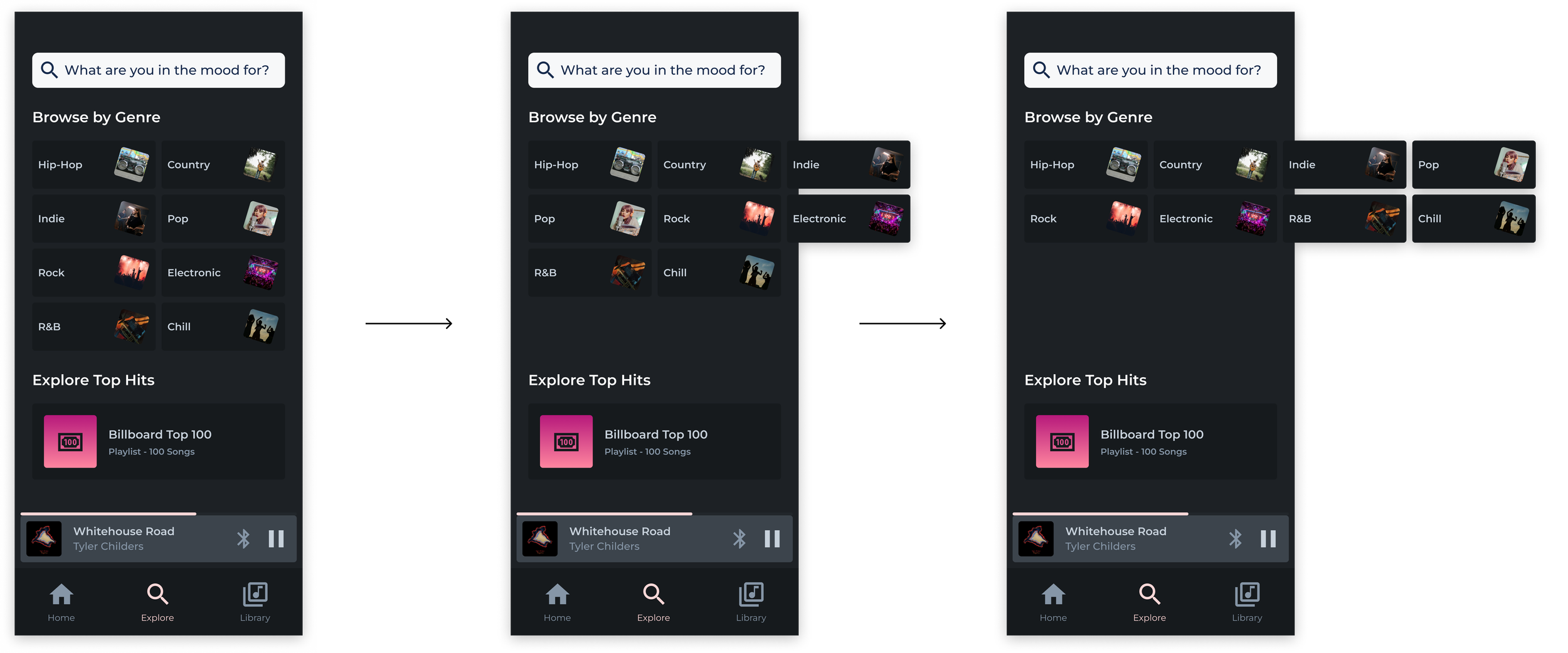
FINAL PROTOTYPE
For my Final Project, I designed several sample screens for a media player app utilizing the prototyping knowledge gained in this course. Click the button below to browse my prototype.

RETROSPECTIVE
Completing this project taught me a great deal about how to design more efficiently in Figma. By utilizing atomic design, components, variables, and auto layout, I can quickly create more dynamic and consistent prototypes. These skills are invaluable in my career and beyond.